Visualizations from the "FAA Wildlife Strikes Database"
by Jesus M. Castagnetto
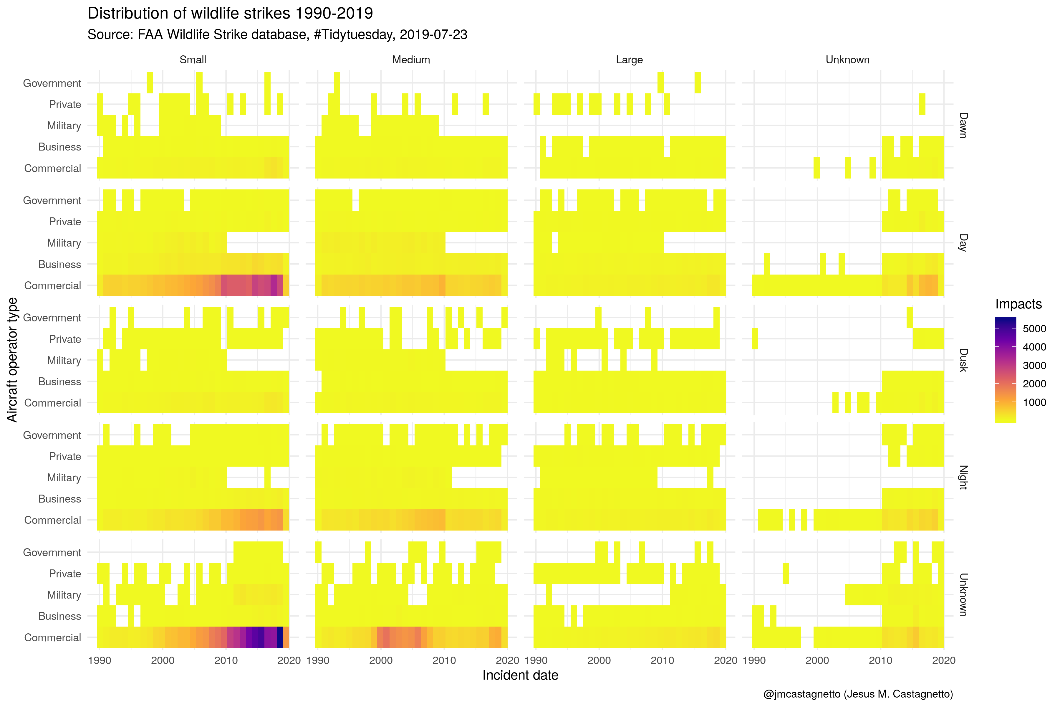
First, a heatmap showing the distribution of wildlife strikes from 1990 until 2019 by size of the animal, time of day, and type of organization to which the aircraft belonged (Government, Private, Military, Business, and Commercial airlines).
An movie in mp4 format of the heatmap using rayshader for R. Below is an animation of the mp4 as a gif file
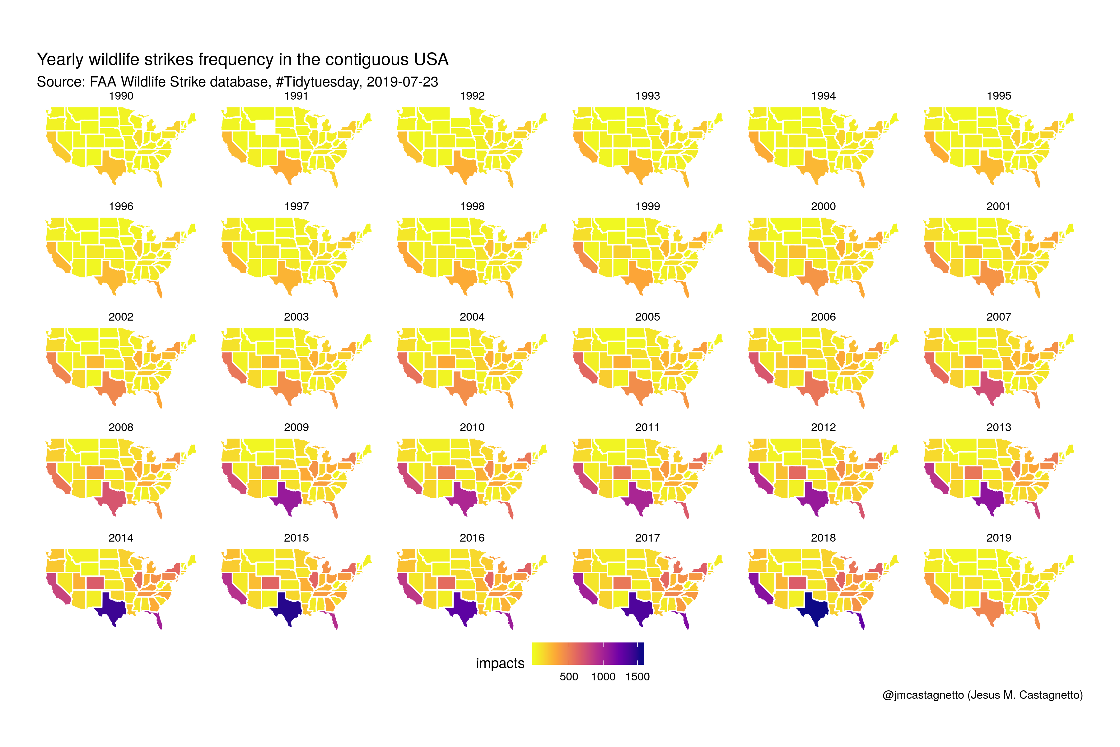
The second visualization shows a small multiple of the yearly frequencies of strikes for the USA contiguous states, showing that in recent years Texas and California are responsible for the majority of this incidents
Also, generated a mp4 movie of the graphic above, and below the converted gif animation:
Categories: tidytuesday - R