Chart, map and globe showing nuclear explosions (1945-1998)
by Jesus M. Castagnetto
The visualizations here were made using the #TidyTuesday dataset of nuclear explosions which where published by data is plural. Originally the information came from a report by the Stockholm International Peace Research Institute (SIPRI).
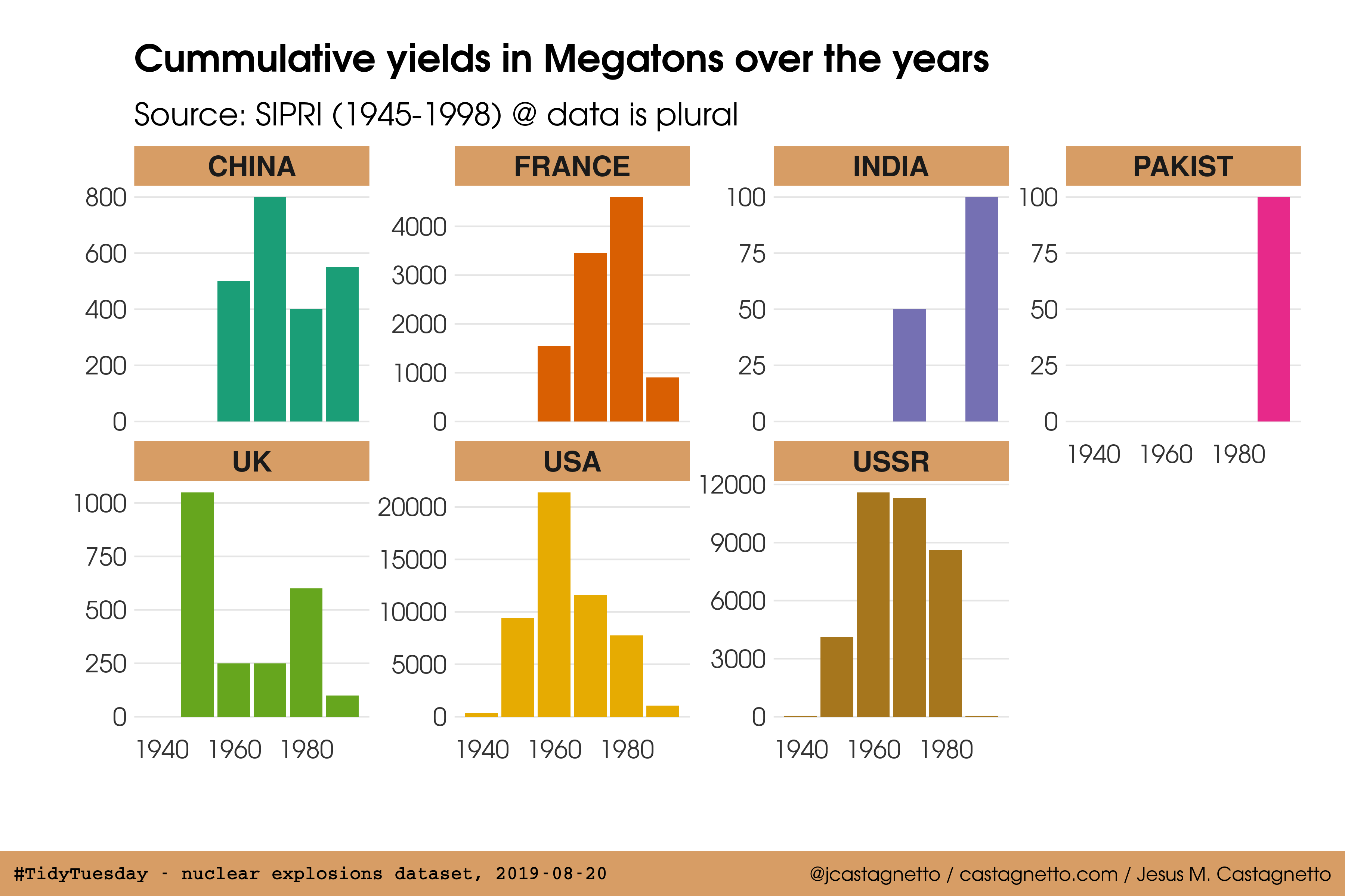
Chart of the cummulative yield by country
The following chart compares the cummulative yield (the sum, in Megatons, of all nuclear devices detonated) for each country from the 1940s to the 1990s.
A timeline of the nuclear explosions from 1945 to 1998
This timeline of nuclear explosions (1945-1998) was produced using echarts4r, and shows the location of the nuclear explosions, using the range (radius) of the thermal effect for the size of the symbol.
According to the Nuclear Weapons FAQ, the range (radius) in kilometers for a thermal effect capable of producing third degree burns, can be approximanted using the equation: $r_{thermal} = 0.67 \times {yield}^{0.41}$.
An interactive spinning globe showing all nuclear explosion locations (1945-1998)
Globe showing locations of nuclear explosions (1945-1998), made using echarts4r.
According to the Nuclear Weapons FAQ, the range (radius) in kilometers for a blast effect capable of producing 20psi of pressure (basically 100% mortality), can be approximanted using the equation: $r_{blast} = 0.28 \times {yield}^{0.33}$.
Categories: tidytuesday - R