The Simpons 7 degrees of separation
by Jesus M. Castagnetto
Used the Simpons guest dataset from the TidyTuesday project.
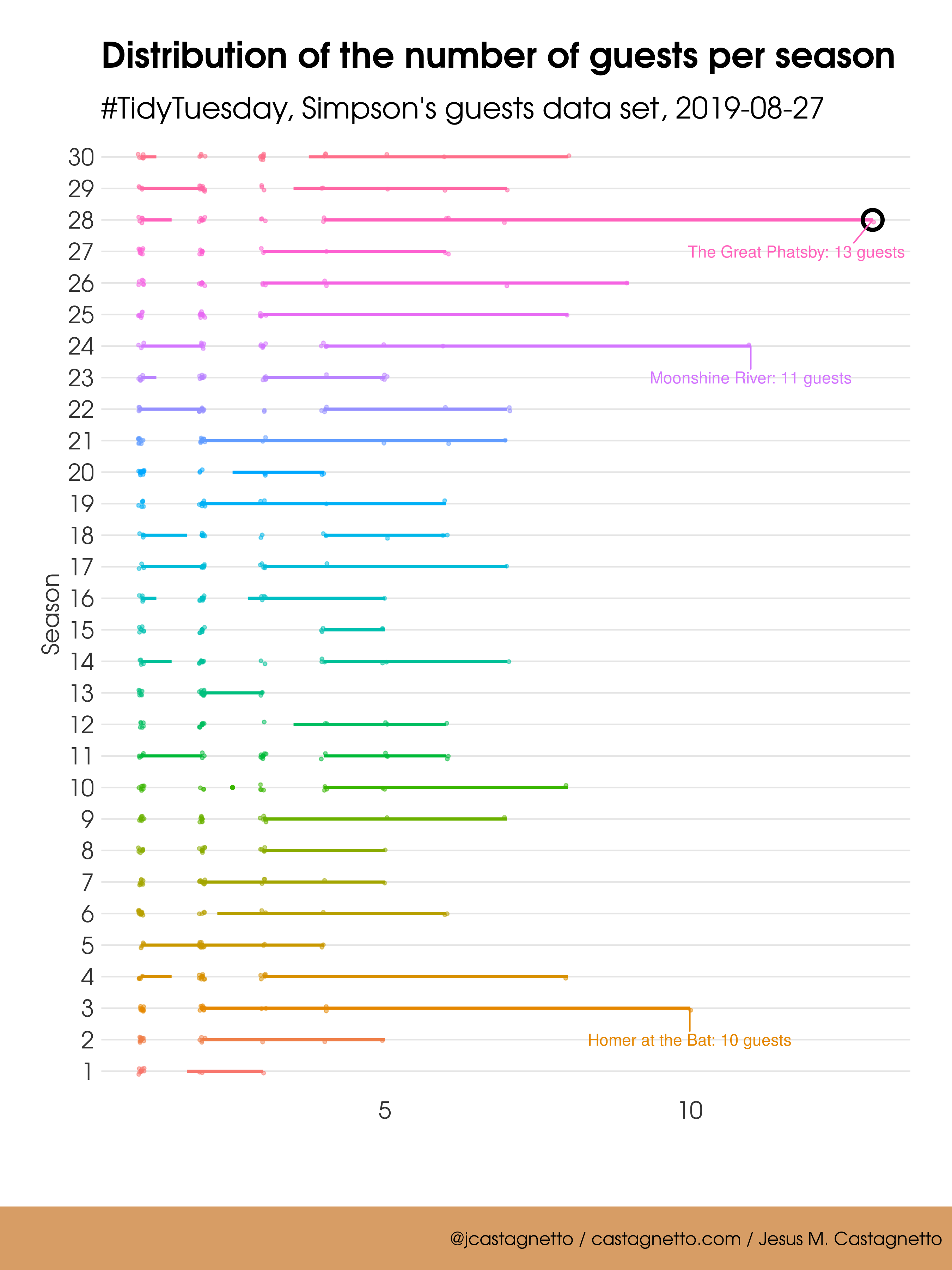
First, I looked at the distribution of the number of unique guests per season and episode, and overall seems like in “The Simpsons” they like to have guests in small groups, although occasionally the groups can be bigger. This is pretty consistent over the seasons, with one episode (“The Great Phatsby”, Season 28) where there were 13 guests. There were two more episodes with 10 or more guests: “Moonshine River” (Season 24, 11 guests) and “Homer at the Bat” (Season 3, 10 guests)
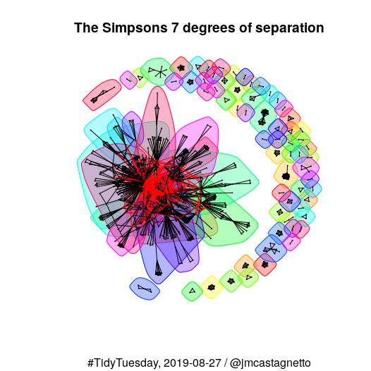
A newtwork of guests
Then, I grouped the guests by when they appear concurrently in an episode, and used igraph to try and cluster them in “communities”
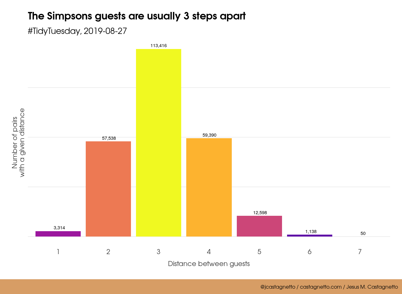
Using the network, found that the longest distance between two guests is 7, so is “The Simpsons 7 degrees of separation”. But the most frequent distance is 3, and a great majority are related by 2 to 4 steps.
Made the network into an interactive graph using visNetwork. You can use the dropdown to pick a guest, “Marcia Wallace” is important in this network, because she has a lot of connections to other guests.
An interactive visNetwork graph
Just for kicks, made another interactive graph using networkD3:
An interactive networkD3 graph
Categories: tidytuesday - R